Recently,
I took an online marketing course designed specifically for ecommerce
businesses. If you’re unfamiliar with this term, it’s where businesses
(small and large) sell their products on the Internet. Given this new
insight, I thought it worthy of sharing with you.
Since a lot of people are unfamiliar with the nuances, we’ll stick with the basics. However, if you do have any questions, feel free to comment below or connect with us on social media!
Your E-commerce Site Map
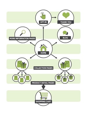
This seems fairly simple, right? Nope, each of these elements has multiple layers and optimization techniques.
Let’s start with your home page.
When a visitor lands on your site, chances are they didn’t come directly to your home page. With a well thought out marketing campaign, visitors are going to hit your blog post, product pages, etc.
But just like most internet users, they’re going to be curious enough to click around your website and land on your home page.
From top to bottom the first thing they’ll see is your header. Your header will act as a navigator for your audience.
This has to be consistent throughout the pages, so make sure you optimize it. How do you do that?
- Logo with a link back to home page in top left hand corner
- Search box for viewers to look for your products/services
- Tag line
- Unique Selling Proposition (This could be anything from free shipping, to using all organic material; whatever makes your company different than the rest.)
- Phone number
- More information page – where people can learn about your business
- Link to shopping cart
- Call-to-action
One retailer who really does a solid job at doing this is Zappos.
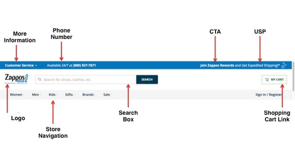
Moving down, the next thing you want your visitor to see is your main banner. This can be show seasonal products, current holidays/events, or any featured products.
Sticking with Zappos as our example, we can see that they’re trying to promote UGG boots this holiday season.
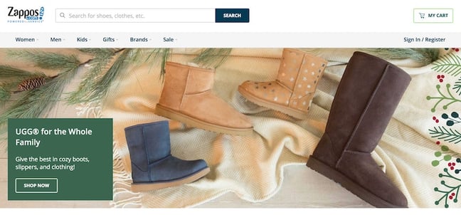
Given it’s the middle of winter, it makes sense to promote these shoes. You won’t see UGG boots as a main banner during the summer.
Now, we aren’t going to walk you through the whole process of setting up your website, but we’ll give you some insight on how to optimize your home page. Along with the above, be sure to include:
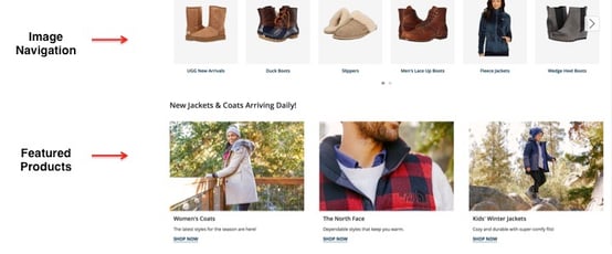
- Image navigation (same thing as a navigation bar but with images)
- Featured products
- Additional content
- Footer
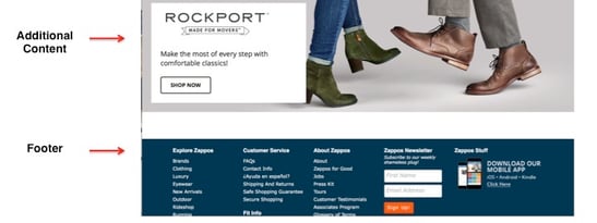
As you can see in the image above, the footer gives you another opportunity to direct your visitors wherever you want. Be sure to include links to pages across your site, more information pages (we’ll define that next), a CTA, and if you want to be more ‘advance’, a chat box so customers can contact you about any issues they might have.
More Information Pages
This is probably the second place your visitors will go to (if you have them.) A more information page is exactly what it sounds like; pages that give website visitors more information about you, your products, etc.
More information pages can be broken down to many types: ‘Contact Us’ page, ‘About Us’ page, ‘Terms and Conditions’, ‘FAQ’, ‘Shipping Information’, etc.
Whatever you decide, make sure you give a clear message about who you are, why they should trust you, and what makes you special/different.
A simply way to do that is by creating two videos; ‘Why buy from us’ video and ‘Hello from the owner’ video.
These videos can be posted not only on your website, but across various channels such as social media and emails.
The ‘Why buy from us’ video
This doesn’t have to be tricky or hard. All you have to do is tell viewers why they should trust you. Try answering some of these questions to help you get started:
- What makes your product or service different?
- Why should the consumer choose you over your competitor?
- What is your unique selling proposition?
- Why do you care about them? Why will you go that extra mile for them?
- What’s your cause? Why are you selling this product or in the business?
Why buy from us video example
The ‘Hello from the owner’ video
We know this gets a bit repetitive at times, but you don’t know which video your website viewer will see.
Similar to the why buy from us page, this video is a bit more ‘down to earth’. Talk about the owner and the struggle they might have had to take. Or why this business is so important to them.
To get started, try answering some of these questions to generate the flow of your video/content:
- Introduce who you are. It doesn’t have to be as a person, it could be about your brand.
- Tell your story. How did the company/brand start? Why did you start the company/brand?
- Create a relationship. Why should the consumer trust you?
- Talk about the guarantees and promises you can make. Maybe it’s 2 day shipping or maybe it’s something unique about your product.
- Thank them for visiting your site.
Marketing tip: this content can be repurposed to many formats! It can be converted to a blog post, series of tweets, an email campaign, etc.
Hello from the owner example
Product Pages
By now, you have the viewer’s attention. You’ve told them your unique selling proposition, they trust you/your brand, and now they want to see what kind of products you offer. The next logical page your visitor goes to is the products page.
Your products page is a list of all the items you sell, either categorized or individually. Remember, you don’t want to list the full details, just a quick overview..
I saw a great example when making a recent purchase. I was in the market for new basketball shoes, so I happened to find their page on Twitter. Once I landed on their site… they had me! I ended up buying 2 new pairs of shoes.
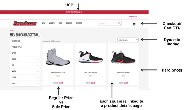
Here’s what worked for them:
- Keep your popular stuff above the fold
- What we mean by this is, people do scroll down your page, but since you have their attention, push your post popular products above the fold.
- Regular Price vs. Sale Price
- Who doesn’t love a good sale? Consumers want to feel like their getting an exclusive discount or sale when making a purchase. (It worked for me and I ended up buying 2 pairs of shoes!)
- Hero Shots
- No one wants to see ugly pictures of a product their thinking about purchasing. A quick hero shot gives viewers a good sense of what they’re buying.
- Product Sales Videos
- Although it wasn’t included on their site, using a sales video can help reel in the consumer. It can simply just be a video of product from all angles; or you can create a product review video too!
- CTA to Add to Cart
- This is self explanatory – you want to bait the consumer to making the purchase.
- CTA to Product Detail Page
- In most cases, just a quick overview isn’t enough to make a consumer add a product to their cart. Make sure your images are linked to individual product page so they can read more about it.
- Dynamic Filter
- Adding a dynamic filter can greatly increase the chances of someone making a purchase. Maybe the first page products didn’t match their pain, need, or interest; however they still want to see more of your stuff. A dynamic filter can help solve this problem.
Individual Product Page
This leads us to the individual product page. All of the elements from above still apply to a product detail page, but here’s what you need to additionally include.
- Multiple high quality images (Gives the viewer multiple angles of the product)
- Well done product description (This is your selling point! Why should they purchase the product)
- Reviews/social proof
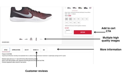
Wow… That’s a lot of information! There’s still a lot more you can do with your e-commerce site such as nurturing your emails.
Since that topic is a long discussion itself, leave us a comment below if you want us to talk about it in another post.
Be sure to follow us on Facebook and Twitter. For more reading on how you can make an impact with your online marketing, see the links below:

